Sunday, October 19, 2014

Mall/Park Design

This is a quick design that I made after seeing an interesting building in a small town in Colorado that incorporated multiple shops into a small plot even though it still seemed open. I decided to take a stab at a design for a week and ended up with this. I had a lot of ideas that went into this, but I won't be able to explain them all. I will cover a couple of the main thoughts. This is a mall incorporated with a large restaurant on the bottom floor that can be independent as well as a park on the right with a green roof that is accessible. The building in this picture has the lower side (on the bottom left) at the water's edge.


This is a side view of the building. I designed it as if it was cut out of a water-side property. To the far side would be a road, and the near side any other building. The wall on the outside next to the cover directs attention, when one is standing on the hill, towards the water and not the property next to it. The roof of the main building is three levels, built to provide maximum parts of the building pointing towards the water since it is the best view.


This is the side porch. It is meant to channel those towards the center section, a hill. I didn't use color, but the middle section is a grassy hill meant to be a park. The roof of the section is a green roof, and there is an entrance at the top. This channel is the main entrance, and the side would be used for art or anything else. There are stairs on the inside to provide a view over the railing. It is also undercover in case of a rainy day.
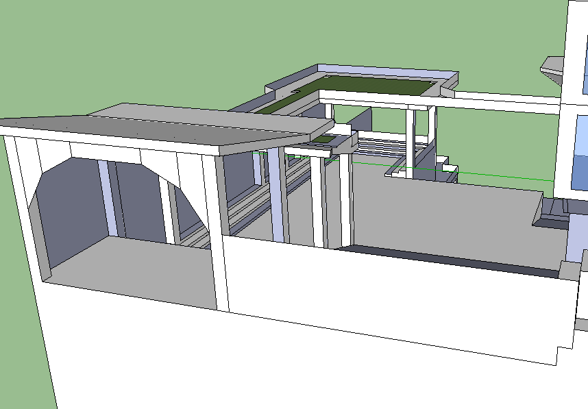


This is under the side section. It has the entrance, which not only funnels visitors in and passes them through the section but also makes the center easier to lock up.


This is a view from the back. The pillars on the bottom are meant to make the top of the building seem weightless over the air beneath it.


This section is meant to be a gathering place for any passing by on the street to the back. The window patterns are meant to be random, therefore supplying light throughout the entire building but also leaving plenty of wall space to make it feel solid unlike a modern building which is all glass in certain areas.


This is a side panorama. It shows many of the bottom sections, which are full glass with pillars to make the top seem more solid. It also shows the other entrance from this side. The three roofs are parallel on the top. There are also rounded windows on the sides to take away sharp edges. Also, there is a porch in the middle to supply two levels and multiple ways to change levels in the first couple of floors to control traffic.


This is the inside of the third floor, with shops on multiple levels and a balcony to create a way to get into the stores on the top. I also had noticed that most other floors were similar and I wanted to create a variance in this pattern to keep the building interesting.


This is a view from the front, where one can see a balcony to the right as well as extra outside seating towards the bottom. Also, in the middle is the area in which the pillars and glass meet the solid upper building. On the second to top floor, there are slit windows because that floor contains food places that need storage and kitchens that shouldn't show to the outside.


This is a view from the top, it also shows the sections on the top of the roof for parties or anything else that are open to the elements but have walls on all sides with windows to present the view but also protect the people from the wind.


This is a view of one of the side entrances, off of the street, to the restaurant on the bottom. It creates a way for people who simply want to eat at the larger restaurant to enter from the street instead of traveling through the entire center.


This is a view of the stairs on the bottom that also lead to the restaurant but also the entrance to the bar that goes through and opens up to the balcony on the left.


This is another view of the restaurant, and the stairs at the outside that lead to the outside seating.


This is another view of a rooftop area.


This is a view, rough cut off, of the floor with the food shops. There are two levels. The top level has balconies over the food shops, and the bottom supplies some area for seating and for lines to the food. This are a connects to the other two level section shown earlier through the sky bridge.

This is a view of the balcony and bar (bottom right) and the stairs that control traffic as well as the elevators in the back for disabled and materials. There are also almost fully glass walls that separate the shops on each level.

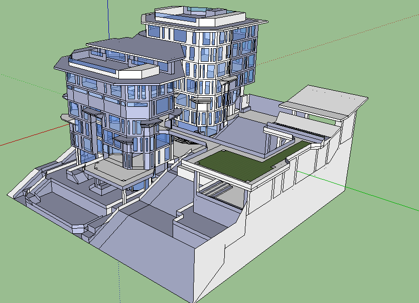
This is a view from under the porch that is under the sky bridge that connects the two. This creates multiple levels that are undercover but outside and more entrances to the shops.


Overall, this was a quick design that is not yet finished. It is a shopping center that also has a large restaurant on the bottom floor as well as seating area on a grassy hill (a park) to the side. It is next to the water and provides a good view. Many of the ideas I was not able to put in, but I hope that you understand the meaning of the design. Thanks for reading!

Saturday, July 27, 2013

The Art Behind Lake Houses

There are many types of lake houses, and I am going to talk about 5 of the ones that I like the most. In lake houses, water is one of the main reasons that the house is built and therefore that is why I think that it should be a part of the house. Many houses use water features just for looks, and they don't have any uses. However, lake houses can incorporate water by having an entrance into the lake inside of the house, and therefore provide a place to park a boat as well.

Simple Lake House

Lake Houses are immediately considered expensive and extravagant, but they can be the exact opposite. There are three things that I like about this house. Number 1, I like the fact that it can be useful to all price ranges as it is cheap enough for someone to spend very little on and live in, and it is also useful to an honor with an adjacent house that could rent it just to store his boat. Number 2, I like the incorporation of the bricks and porch, which provide distinction from one another and therefore create a more complicated house out of a rectangle. Number 3, I like the small dock because it could be used for fishing or other activities and also strongly distinguish the entrance to the storage room for the boat. It also provides a break in the monotony of the lake the house is on and also something to make the house seem stable and not simply suspended over the water.

Larger Lake House
Many Lake houses use not only water from the lake that they are based on, but also a pool. This creates the feeling of being surrounded by water. Also, a pool can be in a house without the worry of sanitation. I love 3 things about this lake house. I love the grass and how it creates a white border that makes the pool seem very controlled, and also outline the house. I like the different angles of the roof, and how the roof is angled so that it is interrupting the monotony of the bottom floor. I like how it uses the clear roof on the right side and the mirror windows to create a way for light to penetrate farm into the house. Also, the gap between the sections of roof and the materials that they are made of makes it so that the pool can be adjacent to the house but not seem to close.


Modern Lake House
This is one of the latest designs of lakehouse. I don't know much about the house, but I'm assuming that they are using the bleached white walls to try and imitate the color of a lighthouse. I like how they split the pool and used stepping stones to make the pool feel like a part of the house. I am not a fan of the tilted balcony, because even though it contradicts the stair and levels it out, it still feels unnatural. I like how the wall extends around the left side of the picture, and makes the area into a courtyard and not a backyard. I just wish that they had kept the balcony level and extended it out farthere to the picture on a corner and made a small hut to make the house feel like the grassy area was part of it. Then I wish that they had used a bleached white wall instead of a window behind the pillar of the right side. Then it would have made the outside feel incorporated to the inside of the house.

Saturday, June 8, 2013

The use of Green Energy and Self-Sufficiency in Architecture Today

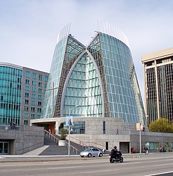
Cathedral of Christ of Light
       The Cathedral of Christ the Light is also called the Oakland Cathedral and is the cathedral in Oakland California of the Roman Catholic Diocese. It was the first cathedral built in the 21st century, and replaced the irreparably damaged Cathedral of Saint Francis de Sales and is the seat of the Bishop of Oakland. Christ the Light is designed by architect Craig W. Hartmann, FAIA of Skidmore, Owings and Merrill. What I like most about this building is how he uses a mixture of curves and straight lines in the shapes that the windows form. The shape is a vesica piscis (which translated mean fish bladder). This design incorporates many of the innovative ideas of Ludwig Mies van de Rohe, who was known for his work with steel and glass. Not only is the building created with style with crossing lines and directions of steel, but it also is built against earthquakes. The shape is formed by the intersection of two circles and the walls, which are rising up from the vault, at composed of overlapping panels of wood and glass. Many have been criticised it on it's huge difference from main cathedrals, no one can dispute it's architectural genius and how cleverly it has been made energy self-sufficient.


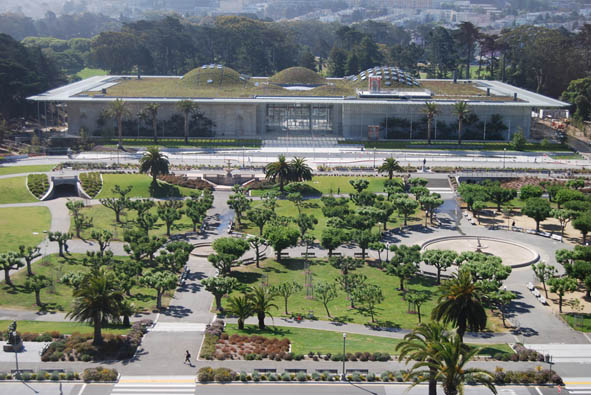
California Academy of Science
        The academy conducts research in 11 different fields, including anthropology, marine biology, botany, entomology, herpetology, ichthyology, invertebrate zoology, mammalogy, and ornithology. This building has been argued to be the most environmentally friendly and self-sufficience colleges, and has many features that were implemented by Renzo Piano that earned the building the Holcim Silver award for self sustainability. 
  • Produces 50 percent less waste water than previously
  • Recycles rainwater for irrigation
  • Uses 60,000 photovoltaic cells
  • Supports a green roof with an area of 2.5 acres (1.0 hectare)
  • Uses natural lighting in 90 percent of occupied spaces
  • Was constructed of over 20,000 cubic yards (15,000 m3) of recycled concrete
  • Construction includes 11 million pounds (5,000 t) of recycled steel
  • Wall insulation made from scraps of recycled denim
       The academy was built around the environment, and uses three domes to interrupt the rectangular shape. In my opinion, they should have man a courtyard and extended a glass side through the fountain that is in the middle. This would have created a more enclosed space, and they could have used a low ride wall to create distinction. On the side that is extended I think that there should have been a tunnel that goes through it, and if a hill had been there it would have been convenient for a tunnel that goes through the ground to continue the road. On the web, it says that the domes containing plants and animals use water that is recycled from the main building. 


        They use curved walkways and the intrusion of plants to make the inside seem connected to the outside and not just a building. In my opinion, when using plants in a building one must use very little or a lot, because an amount that is in the middle would seem sparse and look decorative instead of a part of the building. the use of plants and shrubbery underneath the walkways, they seem to float as the supports blend in with the trees all around. Use of plants wise, this is my favorite architectural design.


Wat Pa Maha Chedio Kaew Temple
      This Temple in Thailand is made of 1.5 million old glass bottles and was made in 1984. Every inch is made out of these recycled beer bottles, and the pond out front is the recycled water of the temple. This temple uses bottle caps and other materials for their decorations. Not only does this idea save materials and use materials that aren't needed like caps, it also displays to the visitors clearly what the temple is made of. They also use the direction that the temple is facing to create an easy pathway for natural light to filter throughout the entire complex. This is definitely the most interesting building when it comes to recycled materials.
Design made from Bottle Caps
     

Sources: Wikipedia on California Academy of Science/Cathedral Christ
of Light

Sunday, May 5, 2013

Different Kinds of Architecture and my Favorite Aspects of their Techniques

Early Modernism:
Asmara Historic City Center
What I do like is the beginning of the tiered box type roof that I see a lot in modern architecture, and the wrought iron railing is a nice touch in my opinion since it accentuates the balcony. However, I don't like the front, as it does not fit with the sharp cornered designs of the rest of the house. It also just out as the rest of the house is  a flat surface more or less, and this focuses all of the attention on it and the curve is not supposed to be in a modernist design. This surely fits into early modernism as it has some of the major points of modernism but is still developing into what it is today. In my opinion, if they had put an overhang with another accentuated balcony on top and made it mostly glass-walled with the planks on the sides to give some cover, the house would have benefited tremendously.

International style:
Le Corbusier
What I like about his type of design is how they use the technique of elevation by support over the landscape. It uses a very industrial look almost like a warehouse on stilts, and uses white in most of its designs. Many shapes are used, and the angles are precise and perfect. The thing that I don't like about his king of architecture is how symmetrical it is, and if the architect had brought the right side down to the ground and then took different levels of that design with different depths and widths and had then slowly shrink as they go up, it would benefit the design immensely.

Brutalist Architecture:
Brutalist work building
Brutalist architecture is in my opinion is the most intriguing, as it is different from all of the other forms of modern architecture  It uses rough concrete in almost all of it's designs, and is mainly used for apartment/work buildings. It displays rough concrete squares and rectangles and is precise. It's pillars and supports are few but large. In my opinion, this architecture is useful and interesting in downtown buildings, and the only thing that I do not like about them is the fact that it is the same height on all sides. If an architect was to imply different levels with different rough rectangles, it would make the building seem less controlled and look really different.

Contemporary Architecture:
Contemporary Building
Contemporary architecture uses many different levels and different angles to form many skewed shapes that sit precariously upon one another. I also uses many overhangs and seemingly unstable supports to put across the idea of defying gravity. This style is used mainly in office buildings and large business buildings because a house of normal size would be hard to use many levels and overhangs in. To be effective, this design idea needs to be used in extreme sizes, and the one thing about this technique that I don't like are the continuous windows that are used.

Neo-Modern Architecture:
Neo Modern Apartment Building
This technique uses shapes and angles that defy the idea of straight walls and defines buildings from all other forms of modern architecture. In this technique, angles contradict and lead to one another while the windows always stay straight, which even more accentuates the angles. Personally, I am not a fan of this kind of Architecture.


Saturday, April 20, 2013

The Use of Different Kinds of Staircases/Access to Different Levels

It has been a while since I made my last post because I have been on vacation for two weeks. I apologize and hope that this post will make up for it. For this post I am going to talk about some of my favorite uses of staircases and how different houses that I like utilize them. I will also talk about what I don't like about designs.

Staircase from a modern house
There are some things that I like about this design, but many that i also dislike. My favorite part is the contrast between the colors of the staircase and the mold on which the wood is placed. I also like the fact that the staircase reaches multiple levels. In many houses, the architects use multiple staircases to reach the levels, and if the house has 3 levels, the architects needs to use two sets of stairs just for one way up. That means that for two ways up, the architect would need to have two sets of two stairs. This would overcrowd the house with stairs and mean that the house would need to be much larger. However, this would mean that the stairs would be farther apart. to solve these problems, an architect could just use two stairs that reach multiple levels or just put two stairs closer together. This would make the house far easier to move around and make everything on the different levels feel closer. The two things that I don't like about this design is how abstract the stairs are, and the surroundings. The stairs bend two abnormally, and I feel like walking up them would be disorienting. Also, curled stairs were mainly used in older buildings such as fortresses, and unless the building has plenty of wrought iron and different sections of house, the stairs do not fit in well in my opinion. Also, I do not like the lack of a railing, because that gives definition to the shape of the stairs and also make them more secure and safe. The walls also blend into the stairs, and I do not like this because it makes the stairs seem like part of the wall and in my opinion should be defined on their own. As well, there is nothing largely different from the stairs that give the eye something other than blank wall to stare at on the stairwell.
Staircase from a Modern House

What I love the most about this staircase is mainly what I was talking about in the other staircase. It uses one area to get to multiple different levels. In this house, the different levels of the table with chairs and the main floor would have needed 2 staircases if the architect hadn't made this one reach multiple levels. This would have taken up lots of room in the house and also made it less accessible as you would have to walk around the corner. In my opinion, staircases in houses that are open should feel less closed off and also should not feel fenced in. In more closed, sectioned off houses wrought iron railings would be the best choice. That is why I love that the architect put spaces in between the stairs and also made the railings see-through to give them the feeling of being accessible.

My main idea for this post is...
Staircases in sectioned houses with closed off rooms should be closed and have a strong railing, while staircases in open houses should be the opposite. Stairs should have distinctly different color tones than their surroundings, and should also reach multiple levels to save space. Finally, I think that to have an interesting piece of furniture or an array of plants or a bookshelf next to a stairwell makes it more interesting and not as monotonous. 

Saturday, March 30, 2013

My favorite parts about Frank Lloyd Wright's design style

During this blog post, I'm going to show some of my favorite designs by Frank Lloyd Wright and discuss my favorite design ideas in the buildings. Frank Lloyd Wright was born in June 8,  1867 and died in April 9, 1959. He was an American architect who designed more than 1000 structures and completed 532 of them. In my opinion, his design ideas are unrivaled and in his field of work he was the best of his time. I will show 2 of his fantastic works and explain exactly what I love about each of them.

Heart Island House:

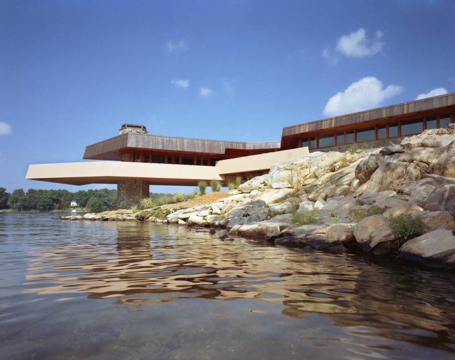
Heart Island House
This magnificent house was built on Petra Island, which is an 11 acre, heart shaped island 47 miles from Manhattan.This house was built around the island's natural rock formations: a 12-foot-high, 60-foot-long rock forms the exterior of the house's entry and a long interior wall, while a smaller "tail rock" encloses the bathroom and kitchen. I will now discuss my 2 favorite aspects of the house.

The Natural Rock of the Island
This is one of my most favorite parts about this house, and how Frank Lloyd Wright uses nature in the house is amazing. There are many ways that Frank brings nature into his house architecturally, and I'm going to discuss the ones that I have noticed. when Frank uses nature, he uses water and land, but keeps plants to a minimum. This lets the house have a feeling of being in nature, but not controlled by it. He uses water in the back by letting the pond go under the exterior walls. The work means that the water feels like part of the house instead of feeling like something on the outside. The rocks that he uses are always in main communal places in the house, and this means that the rocks are seen a lot but are not everywhere. These two techniques alone give the house a feeling of being in and surrounded by nature but Frank makes sure to leave parts of the house free which makes it so that the house doesn't feel controlled.

How Frank uses levels
One of the best parts of all of Frank's designs in my opinion is how he uses levels. In this house, he makes the whole house one level and uses a heave roof (thick) to make the house seem controlled. However, he uses the overhang to let the house have a feeling of having multiple layers even though it doesn't. This is a good mix, as one level would make a house feel boring and flat, and multiple levels can be hard to control and make the house seem very hard to get around and feel closed off. The use of nature and how Frank uses different techniques to make levels interesting makes this house one of my favorites of his.

Imperial Hotel:

Imperial Hotel

This is a totally different twist of design that Frank designed. He uses a mix of old/classical and modernism. There are many designs in here that are classic designs for his houses, and I'm going to talk about my two favorite parts of this building. Frank uses materials that blend well with the landscape. He uses plants on the outside of the house and uses different depths from the outside to bring plants towards the house without actually entering into it. Pillars in the house continue up, giving a feeling of being divided into sections and also support. If one looks closely, Frank used modern architecture in many places, especially the windows. To the left of the main entrance onto the top floor, he uses a design very constant in modern architecture. He uses large plates of glass, and then partially covered them using posts that slightly stick out from the building. This masterpiece of a building uses flow of many different kinds of designs that was fantastic. Unfortunately, this building has been demolished even after all of the work put into it. This is tragic that all that remains of this amazing building are photos and videos. However, hopefully the design and ideas that Frank Lloyd Wright used in this building will be used again many more times.

My overall idea for this post is...
Frank Lloyd Wright was my favorite architect and I hope that if I ever do get a chance to design buildings, I can incorporate his genius into my plans and that his designs will live on. Frank used many different techniques to incorporate nature and many other fantastic ideas into his buildings, and I hope that his genius won't be forgotten.


Saturday, March 23, 2013

How Windows are used

For my design idea for this post, I'm going to talk about how I think that windows should be used and how they are used. Windows and how they are incorporated into buildings is extremely important in how the building looks and the feel of the building. Windows can give a building an open feel to an establishment and can also ruin a building if they are used wrong. I'm going to bring up three of my favorite buildings when it comes to windows and why I like these houses so much.

Luxury Contemporary House Design
The reason that I like this house so much is because the architect used windows
 to make the house feel more open and gave the house a feel of being clear and light and airy. However, when you look closely the architect used a couple of different techniques to make the house still covered. These techniques are using partial cover, using bends in the house, and walls to different sides. Partial cover was used in the window close to the front in which partial blinds cover up the window and let in light, but give the room inside partial cover. Also, the curve of the building causes the rooms inside to have cover from all different angles so that only certain parts of the room are visible. Last, the walls to different sides are when windows and walls are to the left or right and create room in the building but also give cover from all angles. Those are the three ways that this house has windows to let in light and make the house feel open and also lets the house also be covered.

Minimalist house designs from Dave Coleman

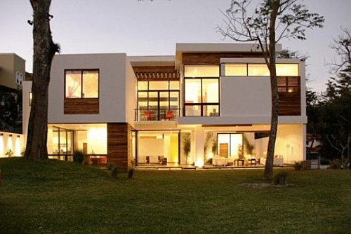
What I love about the use of windows in this house is the fact that the architect is consistent. He uses windows for a whole wall and then uses other walls for cover. These windows are pointed into the main courtyard/lawn to give privacy and still emit a feeling of airiness. In many houses, windows are spaced around and are on each and every wall but are very small. In modern houses, the walls are consistent and are open fully or not at all. This design gives the buildings a larger feeling, as instead of a small window in a wall the side of the house is made of huge sheet glass. The main reason that I used the house above is because the windows are facing towards each other. I like this design idea because when windows are all towards eachother and have a common space it gives the building a centralized area or a courtyard. This building has complete walls on the sides and in the middle next to the pool has walls that are open and completely see-through. This gives the pool a feeling of being in the center and gives the house something to be centered around. 


Modern Contemporary House
What I love about this house is how the architect put the windows on in different levels. what I mean is that each set of windows that is covering a wall is at different differences from the front. The reason that this is helpful is because it brings light and airiness to all of the house and not the front. The architect used the differing sections of the house to give it this feel.


My main idea for this post is...
Windows are very important in modern buildings and as buildings develop and change, I hope that windows work there way into more of the designs. Windows should be used to give an open feeling to the building, bring light to the whole house, and let the house be centralized around an area that the windows are pointing towards.